Application Overview
The Page Editor Back to top
After adding a web page to edit, you will be taken to a screen like this.

Select any parent element: Select any parent of the currently selected element all the way to the root <body> element.
Select siblings: When the selected element has siblings, left/right arrow buttons will activate to let you select a previous or next immediate element siblings.
Select children: If the element selected has other element siblings, a button will enable to select the first one.
- Highlight & locate a modified element.
- Roll back changes from an element.

Publish page edit: Once you have a set of changes ready, this option displays a dialog to run the publishing process of your changes.
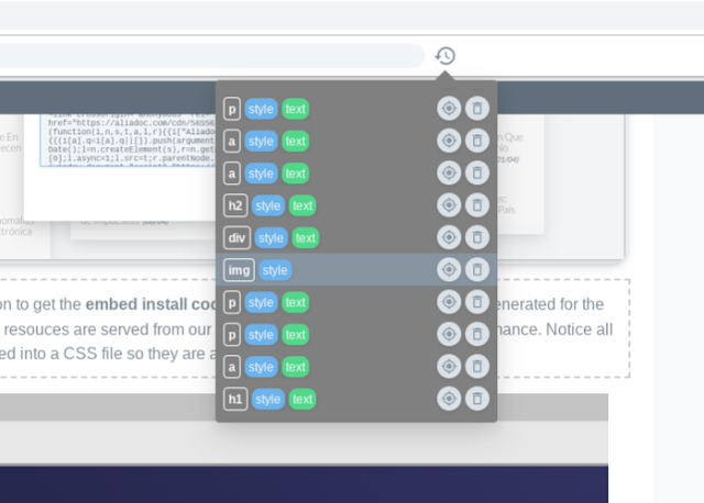
Publish history: Shows a dialog with a listing of the different times you have run the publishing process for this page.
Get embed code: When you publish a page you will get an embed code to install in your page source code. You can get the code again anytime from this option. For more information about the install process check out our Installation guide
Preview changes: Preview your page changes as if they were published.
- Discard all changes: Rollback all page changes so far if you want to start over.
- Report a problem: Are you experiencing an issue with your page? Let us know with this option.
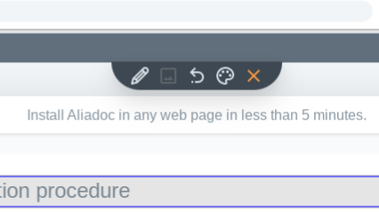
Change image: If the selected element is an image, this button will activate to let you change it. Note this does not work for background images, for that case you will need to use the style dialog.
Revert style changes: If the selected element has style changes, roll them back with this button.
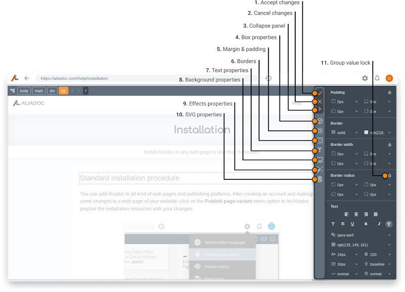
- Open the style properties panel: This button activate the style properties panel. Details of this panel are presented later in this guide.
- Close: Unselect current element selection. You can do the same by pressing the ESC key.
Additionally, when an element with text content is selected and edited, a different toolbar # with options specific to text edit sessions is displayed with the following options:
##
- Auto translate: Apply an automatic translation for the text content. Will display a dialog to let you # choose between 4 different translation engines.
- Revert text changes: If the selected element has text content changes, this button will # let you roll them back to the original text.
- Accept changes: Apply text changes made to the element.
- Cancel: Cancel the editing session. No changes to the text will be applied.
There are times when content or whole page sections are hidden and only become visible if the user interacts with the page. The interaction mode allows you to stop selecting elements and use the mouse to click and reveal content that may be initially hidden like menus, sections, roll-overs, etc...
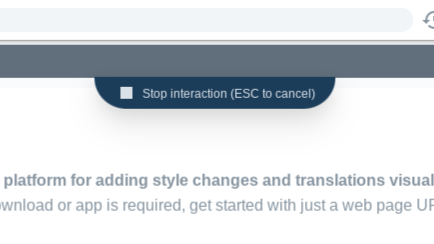
You can cancel an interaction session by clicking on the top button (the one with the Stop icon) so you can go back to select elements again.
All: No responsive breakpoint selected. All style changes apply to all sizes. This is the default value.
Phone: The smallest size for mobile phones. All styles applied when this breakpoint is active will only be applied to small screens.
Desktop: Changes applied when this breakpoint is active will only be visible on devices with large screens.
The Styles Panel Back to top
When activating the style button action, the styles panel will appear.