Get started with Aliadoc
Enhance style of any Shopify web store, adjust padding and margins of page elements visually, change images, add effects, change fonts and more - all in a handy Shopify app tied with a full featured free-form visual page editor. With Aliadoc fine tuning style of your web shop is easy. Just point and click to select an element and start adding changes.
Each change you add to a page gets recorded as CSS definitions. Publish your changes for everyone to see, with a simple publishing process that captures your current work and generates CSS file assets that are then installed in your active shop theme automatically.
Next time you add changes to the same page, just run the publish wizard again to get the static assets updated and that's it, your style updates will be picked up immediately.
What you need:
- 10 Minutes
- A published Shopify web store
Note: You can use Aliadoc on most browsers on computers and mobile devices. However, at this time, you can only edit pages on a computer using Google Chrome or Mozilla Firefox.
Guide contents
Section 1: Select a page to edit Back to top
Check editable pages in your web shop
Open the Editable Pages tab by clicking it. You will see a list of pages with buttons at the top to filter by Products, Pages, Collections and Blogs page types, plus a filter field at the opposite corner to quickly locate the page you want to edit.

Click on a page path or on the Edit button at the end of each row to begin.
Page URL and path prefix
The edit page dialog is displayed after clicking the Edit button of a page, it has two editable fields: the first one contains the path of the page you're about to edit. Only the path part is editable and you can change its value manually, which can come handy when the page you want cannot be found in the list.

The second field is initially disabled. It is the path wildcard field that activates with a checkbox and lets you define if the editing session will affect all pages sharing the same path prefix or just the single page. This can be changed later if desired.
When the checkbox is activated, a path suggestion populates its value. Notice the value ends with an "*" (asterisk) character, this is a requirement that must be honored in order to continue. Clicking the Continue button will open the page editor.
Find the pages you've edited
Click on the Edited Pages tab to display the list of pages you've edited so far. In this list you can see which pages you've edited, which ones are published by the status icon at the begining of each row and the kind of edit you made (match column).
Additionally, you have access to other functionality for each edited page like the ability to copy style changes from one page to another, editing the page again or see its original version. There's an extra set of actions, visible with the options menu, including Un-publishing changes, change its path match mode, see how many times the page has been published and finally an option to delete the page edit.

But the most important piece of functionality you should care about is by far the Publish action button. This opens up the publishing wizard dialog, which is a simple process that packs the page changes into a CSS asset file and installs it in your active theme. By the end of the process your page changes will be immediately visible in your web store.

Section 2: The page editor Back to top
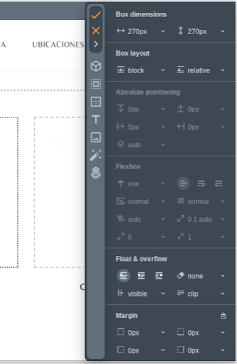
Margins, padding and size
Adjusting margins, padding and size is simple. When you select an element, a set of draggable handles appear to modify each of those values visually.
Except for the blue resize handle at the bottom right corner, each of them let you change values for all sides of the element: top, bottom, left, right:
- Margins: Dragging orange handles adjust element margins. Drag outward to adjust.
- Padding: Drag green handles to adjust element padding. Drag inward to adjust.
- Re-size: The blue circle handle at the bottom right corner changes the element size.
Set or change background images
Change or set a background image on any element you select. You can set it easily by clicking the image icon from the toolbar displayed when an element is selected.

Any image you set are URL values. Images used in websites are ultimately resource URLs; references of image files to load from a web server. If you have a local image file to use, select the image option of the menu in the background image reference URL field to open the Resouce Manager: A panel to manage image resource uploads and allows you to search for an image in Unsplash a royality-free stock image service.
Change style properties
A full range of style properties are available to customize appearance of a selected element. Once an element is selected, click on the color palette icon from the top toolbar to activate the style properties panel that will show up on the right hand side of the screen.
Big icons at the top left side of the panel includes a big orange check mark icon button to accept changes, a cancel (X icon) button and an arrow icon button to collapse the panel to show any element not visible because of it. The rest of the icons represent different style property groupings and serve as quick access links or bookmarks.
Available properties to change are modeled after CSS (Cascade Style Sheets) properties of the same name. Each property field has a value helper (small arrow next to each field) that can come in different forms: As a range slider, a list box or a color selector. Notice some sections have a lock icon at the top right corner to enable/disable value mirroring: A handy feature for all fields in the group so if you change one, the others change as well to match the same value.
Notable style properties you can change are: round corners, borders, text and box shadows, colors, change fonts, a full set of text and background properties and much more to fine tune everything.
Moving to parents, children or siblings of the selected element
When you select an element in the page you will notice that, apart from the toolbox that appears at the top center, there's another element that becomes quickly apparent: A strip with a list of short tags that ends up with an element highlighted in orange (representing the current selection) and a set of arrows.
To be fair, this is a somewhat advanced selection control that relies on the way web pages are laid out. Web pages are stored as a hierarchical data structure composed of several tags, most of them wrapping others like skin layers in an onion. What you see in a page is in most cases a tag element, wrapped by several others that helps its appearance to be the way it is. In web pages, there's always more than meets the eye, so the element we select could very much not be the one we are supposed to adjust in order to get what we want.

Aliadoc aims to be a tool that makes all that easier to visualize. Each element in that breadcrumb list of tags at the top, switch to the corresponding element up to the root body tag in the page layout hierarchy. Arrows serve the same purpose, switching the element selection to the left or right sibling with a corresponding arrow for each, or down to its immediate first child. Arrows activates or deactivates depending on the current element selected, so if the current selection has no children, its arrow will be disabled; same goes for the siblings arrows.